Fonts act as the first impression of your landing page copy. Landing page fonts are as important as the message you are conveying to your visitors. Having a well-designed landing page and content with bad fonts will ruin the tone of your message. Landing page fonts can vary depending upon the type of business or service you are providing.
Let’s understand it with a practical example. The landing page of a business consulting agency should give a professional look. However, the landing page of a décor company can be a little bit creative or cursive.
Landing page fonts can highly impact your conversion rate as well because it would be the identity of your content. Now we know how important it is for you to choose the right font for your landing page. Let’s dig a little deeper and find out which are the best landing page fonts. We’ll also discuss which fonts you should use or avoid and why.
[toc heading_levels=”1,2″]
Landing Pages Typography: How to Make Your Copy Shine
There is no certain answer to this but rather depends on the type of website and the content. As discussed earlier, the purpose or type of business for which you are creating a landing page can determine the type of font you should use.
Also, the fonts used on the landing page should depict the aesthetics of the business, service or brand. You’d know when you have chosen the right landing page fonts when it complements the message you are conveying.
What Are the Types of Fonts?
Before we move on to the types of fonts there is one more thing you must know about and that is Typeface. So, let’s learn what typeface is.
Typeface
Typeface describes the design of the alphabets in any font. If you are choosing the typeface it is recommended to choose the one which is easy to read and captures the true essence of your business.
Now if we classify the fonts into different types then we come up with four main types of fonts. Let’s see what these four types are, how to differentiate them and when to use which type.
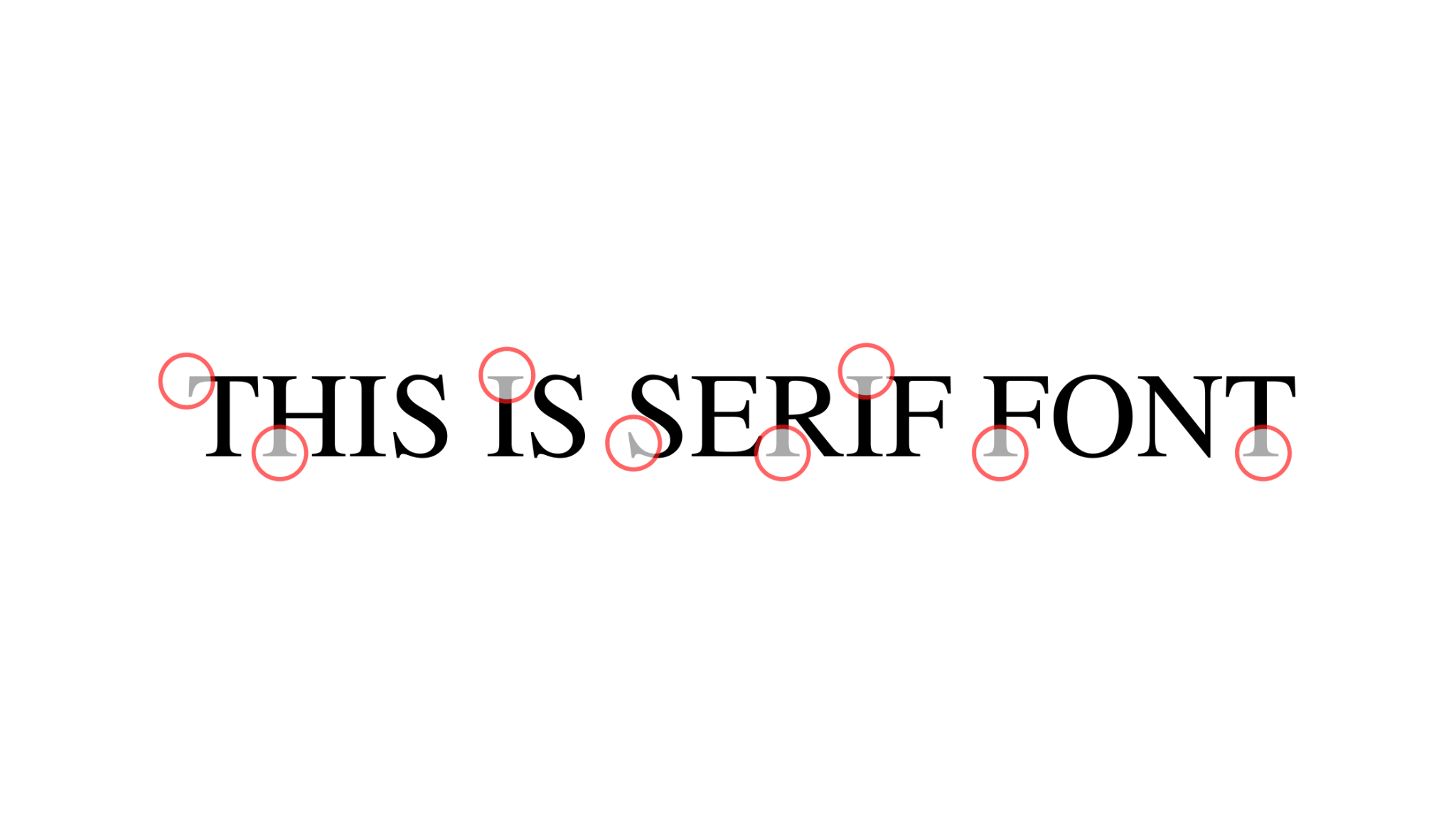
Serif:
This type of font has “feet”, or we can say contain edges at the end of the letters. In other words, alphabets written in serif have a stem. These are used when you want your text to be a little decorative while keeping it professional as well. Simplest and best example of serif is “Time New Roman”.
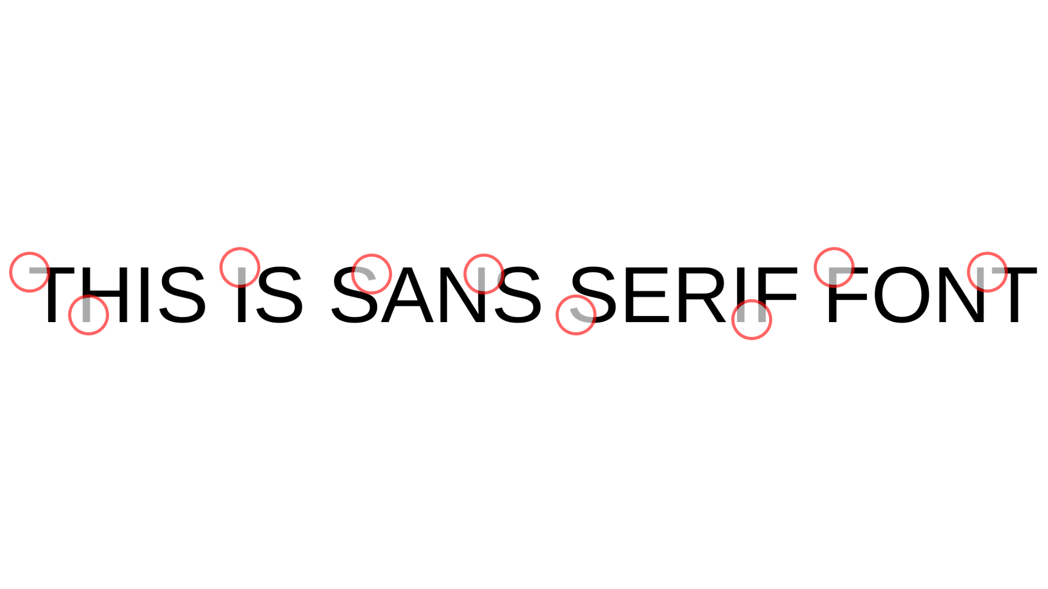
Sans Serif:
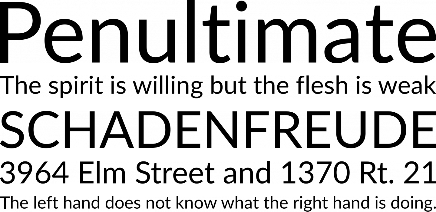
The name of the next type tells everything about itself. As “sans” means without in French and serif means feet. So, sans serif is the font that doesn’t have any feed to edges at the end of alphabets. Arial and Verdana are examples of sans serif fonts.
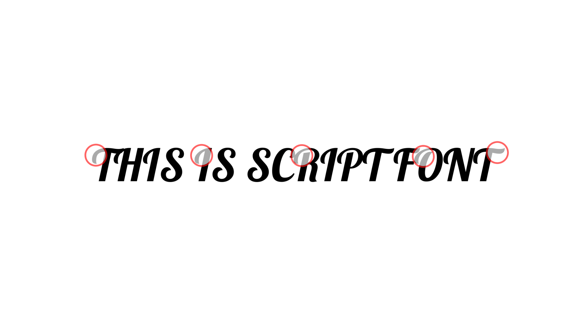
Script:
This type of font has connecting strokes with curves or you can say it is the cursive writing style. Typically, these fonts are used for writing codes. Common examples would be Sacramento and Lobster.
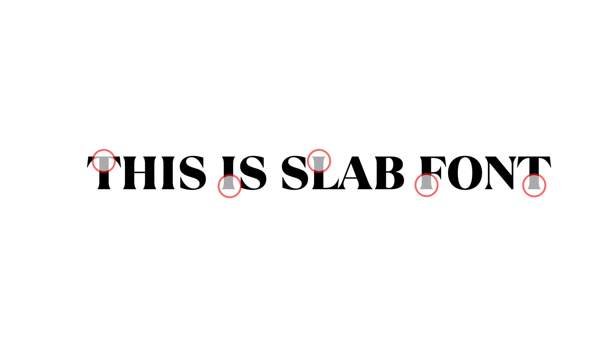
Slab:
These are the types of fonts which are bold and thick. Some of the slab fonts have serifs and some don’t. Mostly used for headlines and best examples of these fonts are Slabo & Rammetto One.
After this sorting we know that serif and sans serif can be used for body copy or logos and titles. However, slab and script are only suitable for headings and coding.
Decorative typefaces
Decorative typefaces are those that don’t fit into any of the other categories. They can be serif, sans serif, or script, and are often used for logos and titles.
Type Classification and Families
There are certain factors that are important in classification and families beside typeface. Having know how of these factors will highly improve your sense while choosing the type of classification and font family.
Kerning and Leading
The white space between the letters should be perfect as it impacts readability of your text. Text having no white space between its letters is hard to read so is the text with too much white space between two letters. There should be a good balance of white space between the letters to be readable.
Kerning refers to the space between the letters while leading refers to the line spacing or space between two lines. This is vital to check because your landing page would load on devices with different screen sizes.
Weight
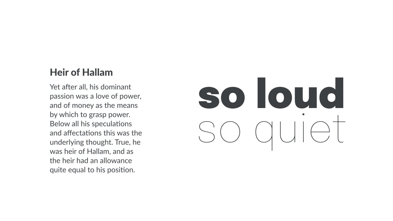
The weight of the font means how thick or thin your font appears on the landing page. Classification of weight is pretty simple as the font with higher weight (bolds/strong) is best for headlines.
This will help grab the user’s attention immediately. Body font should have less weight compared to the headlines. Make sure that your text is easy to skim without having a strain on the reader’s eyes.
Size
Size matters as much as the weight of the font. Just like weight is higher for important text, similarly size must be higher for such text. That is why headlines must be in bigger size and body text should be relatively small but not too small.
The text size must appear like a hierarchy with headlines having the highest size. While size decreases in sub-heading and body text. Size range should be in between 12pt to 18pt.
- Color
It’s always a good idea to use a contrast color for catch phrases and headlines to focus attention. Colors in fonts have a psychological impact on the visitors of your landing page.
You have to make sure that the contrast in the colors you choose is perfect otherwise readers would have a hard time reading it. Best idea would be to use the color wheel to opt for the right color schemes and contrast.
- Pairings
Utilizing the right mix of fonts can make your landing page stand out among others. Finding the right pair of fonts might take some time to figure out but it’s worth it.
Your landing page would give a more dynamic look than a landing page with a uniform font style. In conclusion you should know how to play with different fonts to get your desired results.
- Contrast
We’re not just talking about color contrast here but size and everything to make it perfect. Your body text and heading shouldn’t feel like text from different pages due to different size, color, style and font family.
However, blend in all these things in a way to look smooth and pleasing to the eye. This doesn’t mean you shouldn’t go for different sizes and styles but keep in mind to make it look streamlined.
- Alignment
One of the most important factors where you make a mistake is the alignment. This makes a huge difference as aligned text would feel more professional and desirable to read.
Never make this mistake as mostly people avoid but a center aligned text would have a different feel compared to justified text. It is preferable to keep your body copy justified and headings of landing page center justified.
The Psychology of Fonts and How They Influence Conversions
Yes, landing page and website fonts have a huge influence on conversions. As fonts increase the user experience which helps increase the percentage of conversion rate.
A website or a landing page leaves a mark on the visitor’s mind whether it gives a professional look or not. Since fonts are the first impression so it justifies the answer.
If you are not using the appropriate fonts then users would leave your website immediately, increasing bounce rate. While using fonts in a creative manner and following best practices for landing page design would help them make their decision.
The Psychology Behind Typography
To understand the psychology behind typography you should observe how every font gives a different look and feel. Each font has its own attributes and according to which they are used.
By using a bold font, you are emphasizing on your text. Similarly, using the same font on the landing page but different for your brand’s catchphrase can suddenly grab your visitor’s attention.
Understanding how just a simple change in the font can attract the attention of the user is crucial.
Make sure that your font is readable and easy on the eyes.
Fonts compliment your brand aesthetics.
Utilize different color schemes & styles to attract.
You can do A/B testing if you are unsure between two choices.
Typography for Effective Landing Pages
Marketers focus on things like layout and design while neglecting typography. This can be a huge mistake, because typography is one of the most important aspects of any landing page. You can use these things based on the design principle
Tip #01: Use a Sans Serif Font
When it comes to landing page typography, using a sans serif font is always a good idea. This is because sans serif fonts are typically more legible than serif fonts, which makes them ideal for online content.
Tip #02: Use a Contrasting Color
When choosing a color for your landing page typography, be sure to use a color that contrasts well with the background. This will make your text easier to read and will help it stand out from the background.
Tip #03: Use a Large Font Size
In order to ensure that your text is legible, be sure to use a large font size. This will ensure that even those who are viewing your landing page from a distance will be able to read your text.
Tip #04: Use a Different Font for Your Headings
When creating headings for your landing page, be sure to use a different font than the one you’re using for the body text. This will help your headings stand out and will make them easier to read.
Tip #05: Use Italics and Boldface for Emphasis
If you want to emphasize a word or phrase, be sure to use italics or boldface. This will make the text stand out and will help it catch the reader’s attention.
Tip #06: Use a Monospaced Font for Code Samples
If you plan to include code samples on your landing page, be sure to use a monospaced font. This will ensure that the code samples are easy to read and that they look uniform.
Tip #07: Limit Your Use of Images
While images can be a great way to add visual interest to your landing page, you should avoid using too many of them. This is because images can slow down the loading time of your landing page, and this can lead to lower conversion rates.
Tip #08: Use Appropriate Font Weights
When choosing a font weight for your landing page typography, be sure to use one that is appropriate for the content. For instance, if you’re writing about a light-hearted topic, you may want to use a font weight that is lighter than normal.
Tip #09: Use Whitespace to Separate Sections of Text
If you want to make your landing page text easier to read, be sure to use whitespace to separate the different sections. This will help the reader’s eyes move from one section to the next more easily.
And there you have it! These are nine tips for creating an eye-catching landing page typography. By following these tips, you can create a landing page that looks great and is easy to read.
Typography is more than just the typeface you use on your landing page. It’s about how the text is styled and formatted to create a certain effect. Typography can be used to influence mood, emphasize important points, and control the reading experience. By understanding the psychology behind typography, you can create landing pages that are more effective at convincing visitors to take action.
Best Font for Landing Page
Which Fonts Should I Use to Stand Out in Design?
we have some recommendations for you to choose from. We have listed the top five best web safe fonts for your digital readers.
Arial
Arial is the standard font for many word processors, such as Microsoft Word and Google Docs. It is a sans-serif typeface that was designed for on-screen reading, meaning its letters are wider apart and easier to read than those in some other typefaces.
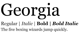
Georgia
Georgia is a serif typeface that was designed for on-screen reading. Its letters are narrower than those in Arial or Helvetica, but they still have some space between them for easy reading.
Best Google Fonts for Landing Pages
Web-safe Fonts and Why You Need Them
Web-safe fonts are the fonts that are widely supported by the web browsers. They are also called as “web-friendly fonts” or “browser-compatible fonts”.
Web-safe fonts were made to be rendered on all the different types of devices and screen resolutions. . However, it is a good idea to use web font services for your website now, because they can make your site look more modern and appealing.
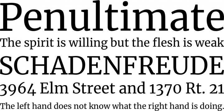
Merriweather
Merriweather is a modern serif typeface that was designed for on-screen reading. It has very thin strokes and wide letters, making it easy to read on screens of all sizes.
Montserrat
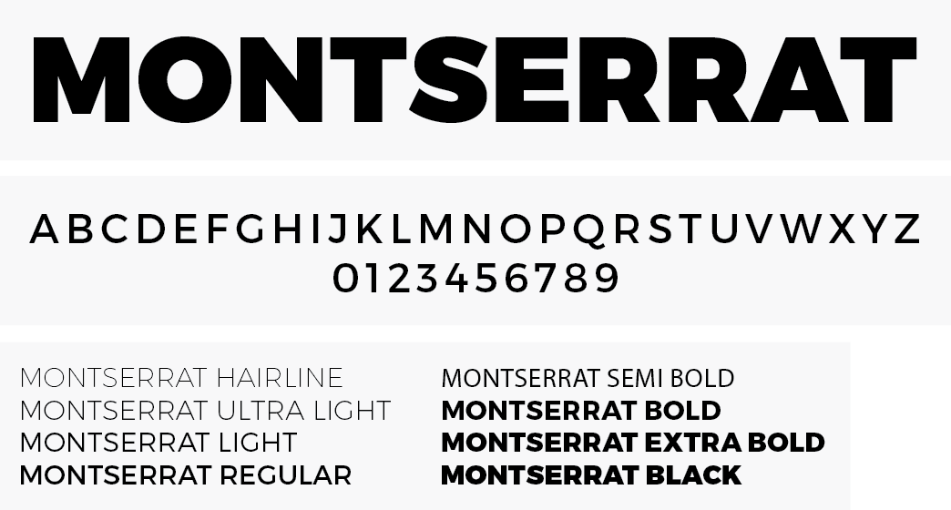
Montserrat is a sans-serif typeface that was designed for on-screen reading. Its letters have generous spacing between them, making them easy to read on small screens.
Futura
Futura is a sans-serif typeface that was designed in the 1920s. It has very thin strokes and wide letters, making it a good choice for on-screen reading.
Open Sans
Open Sans is a sans-serif typeface that was designed for on-screen reading. It has a very wide letter spacing, making it easy to read on small screens.
Lato
Lato is a sans-serif typeface that was designed for on-screen reading. Its letters have generous spacing between them, making them easy to read on small screens. Lato is also available in a variety of weights, so you can choose the one that’s best for your needs.
These are our suggestions that you must check out while choosing the best fonts for your landing page and website.
Should You Be Concerned About Bad Fonts?
Since we’ve discussed the fonts you can use then we should also tell you which fonts you shouldn’t be using. This list contains all the bad fonts you should avoid while designing your landing page or website.
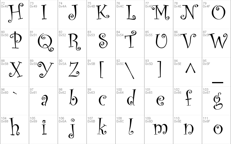
- Comic Sans
- Curlz
- Algerian
- Bleeding Cowboys
- Lobster
- Bonzai
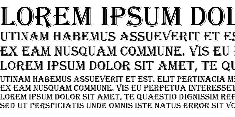
- Trajan Pro
- Neuland Inline
To be honest you should definitely avoid these fonts or fonts that look similar to these. Such fonts would really affect the readability of your text or headings.
Bad fonts are fonts that are difficult to read. They may have awkward letterforms, be too small or large, or have a weird color. Comic Sans, Curlz, and Algerian are some of the most commonly used bad fonts.
Algerian
Algerian is disliked because it is difficult to read, has an odd color, and is often used in inappropriate situations.
While some people may find these fonts difficult to read, others may not have any problems reading them. The best way to determine whether or not a font is appropriate for your website is to test it out. Try different fonts on your website and see which ones are the easiest to read.
Comic Sans
Many people hate Comic Sans because it is overused and often used in inappropriate situations.
Curlz
Curlz is also a commonly despised font because of its awkward letterforms and small size.
Tips for improving on-screen readability
When choosing a font for your website, you should consider the following factors:
– The purpose of the website
– The target audience of the website
– The design of the website
– The type of content on the website
If you are creating a website for a company, you will likely want to use a serif font like Times New Roman or Garamond. Serif fonts are considered to be more professional than sans-serif fonts. If you are creating a website for a young audience, you may want to use a sans-serif font like Arial or Helvetica. Sans-serif fonts are considered to be more modern than serif fonts.
You should also consider the design of your website when choosing a font. If your website has a vintage or retro design, you may want to use a font like Cooper Black or Brush Script. If your website has a modern design, you may want to use a sans-serif font like Futura or Akzidenz Grotesk.
Finally, you should consider the type of content on your website when choosing a font. If your website has a lot of text, you will want to use a font that is easy to read like Verdana or Georgia. If your website has a lot of graphics and images, you may want to use a font like Impact or Tahoma.
The Latest Font Trends for Designing Landing Pages
We’ve researched some of the top trending fonts of 2022. These fonts are not just for professional styles but have creative styles as well. You might be surprised to find out that we found a mix of both thick bold and simple sleek designs. We’ll listed all the trending fonts down below:
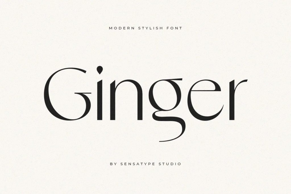
Fluid and Simple Script
These are one of the coolest and most trending scripts in 2022 due to the aesthetics they give to your landing page or website. If you use fluid and simple script fonts then you’ll surely stand out. “Ginger modern display” font is one of the examples of fluid and simple script which really catches the user’s attention.
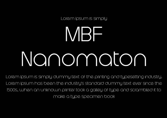
Rounded Sans Serif
If we talk about trending with professionalism, then rounded sans serif is the option to choose. Using this type of font will make your website or landing page look professional and creative at the same time. “NBF Nanomaton” font is one of the examples to look out for.
Rustic Serifs
Rustic serifs font is very classy and should be the top priority if you are designing a landing page or website for fashion. Brand name simply written in this font would be enough to grab the attention.
High Contrast Serifs
Next on our list are high contrast serif fonts because they give a very impactful look to your website. If you want to show your long-time presence in the business, then this type of font would be suitable for you. Best in such category are “Slabian slab serif” font and “Braveold serif” font family.
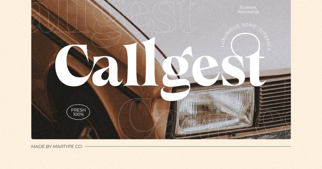
Chubby Retro
This would be the best appropriate font type for marketing as it gives a very fresh look and feel. This font had to be included in the list of font trends of 2022 because it can be your priority font for website or landing page title font. If you want to use it then search for “Kinsale or Callgest Display” font.
Conclusion
Don’t think of ignoring the importance and impact of fonts in your website or landing page conversion. Make sure you have complete knowledge before you choose the right font. Remember that if one font is doing good for one business doesn’t mean it will work for you as well. So, do A/B testing to be sure before you finalize.
