Is your landing page conversion rate low?
Is your paid traffic heading back to your website homepage instead of staying on the landing page?
If you answered all these questions, Yes. Then, your lead generation page might have some significant issues.
You are making huge landing page mistakes that are hurting your conversion rate and revenue.
Landing pages are one of the most important tools to capture more leads for a business. Yet, most companies don’t pay much attention and effort to optimize their landing pages to get optimal results.
Now, we want you to find out and stop making those mistakes again and again. To help you in this, we will be sharing the biggest landing page mistakes that are hurting (or can hurt) your lead generation process. Moreover, you have to understand which type of landing should be used in the process.
We all know how important it is to grab customers’ information. Give attention to all the mentioned mistakes while creating a new landing page.
Have a quick look at the top landing page mistakes:
- Slow Page Speed
- Cluttered Page Layout
- Multiple Call to Actions
- Poorly Written Headlines
- Adding A Lot Of Visual Or Not Adding At All
- Page Not Optimized For Mobile Devices
- Adding Too Many Fields to Form
- Not Mentioning Enough Details About the Product Or Service
- Neglecting Decision Takers Concerns
These are mistakes you are committing during the landing page creation process. Read ahead to find a detailed overview of each blunder, and find the solution as well.
Landing Page Mistakes and How to Avoid Them
Here is a detailed explanation of each landing page mistake you should avoid.
Slow Page Speed
How much time does your website or that particular page take to load fully? 2 seconds? 4 seconds? More than 4 seconds? Here is the answer.
Your page speed could be the suspect for low conversions.
Nobody waits for a long time for a website to load. They jump back and visit another website. Your landing page’s slow speed could be one of the biggest reasons behind the low conversion rate.
According to a report by Unbounce, the average conversion rate for landing pages is around 9.7%-9.8%. If your average conversion rate is lower than this, you must check your website loading speed.
Each extra second can impact your response rate. According to a report by Portent, the first five seconds have the highest impact on the conversions. If your landing page takes 0-5 seconds to load, your conversion rate can drop by 4.42%. In other cases, if it takes 0-9 seconds, then it can drop by an average of 2.11%.
For better results, your landing page should load between 0-4 seconds. Here are a few tips to improve landing page speed.
- Use web cache plugins
- Minify your website files, including HTML, CSS, etc.
- Perform regular speed tests. (You can use GTmetrix to test website speed.)
- Clean unnecessary code.
- Optimize images to enhance speed.
- Use fast hosting.
- Don’t create many redirects.
Cluttered Page Layout
Let’s understand this mistake with an example. We all use social media platforms like Instagram, Facebook, etc. There could be several reasons for using these platforms, such as premium content, high-quality uploads, etc.
Yet, the most important reason we continue using them is their easy-to-use interface and beginner-friendly layout. We spend hours on these platforms because they are easy to use and attractive simultaneously.
Now, resonate this example with your landing page. Having a stunning yet straightforward landing page is the most crucial part of getting effective results. Users also want a simple page with zero distractions.
In addition, most landing pages include multiple offers. Have a look at the study below.
According to the latest landing page statics, adding multiple offers to a single landing page decreases conversion by up to 266%. It confuses visitors between the multiple offers. Hence, they leave the page without taking action.
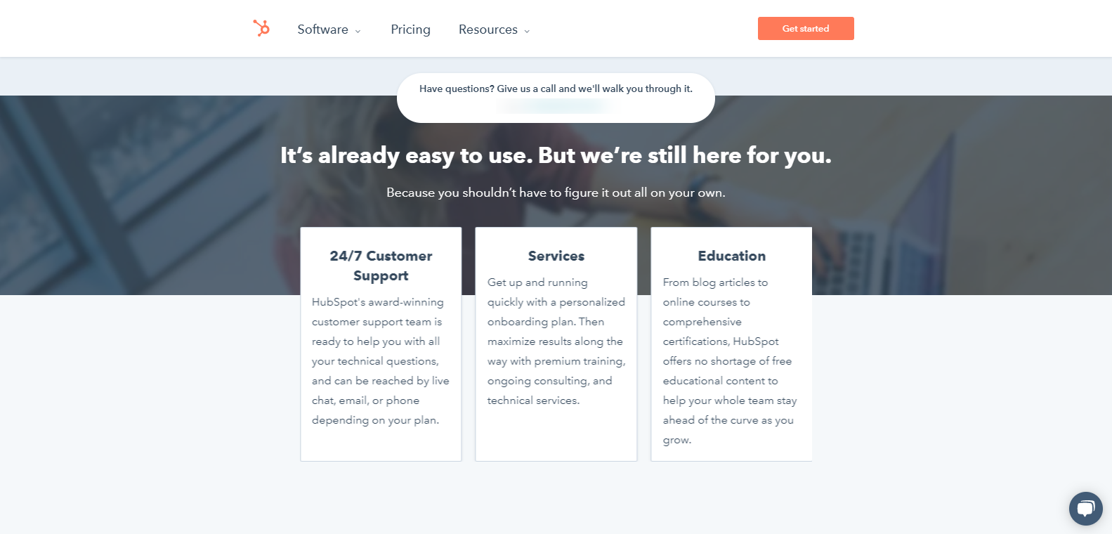
Take a look at the HubSpot Academy landing page as an example:
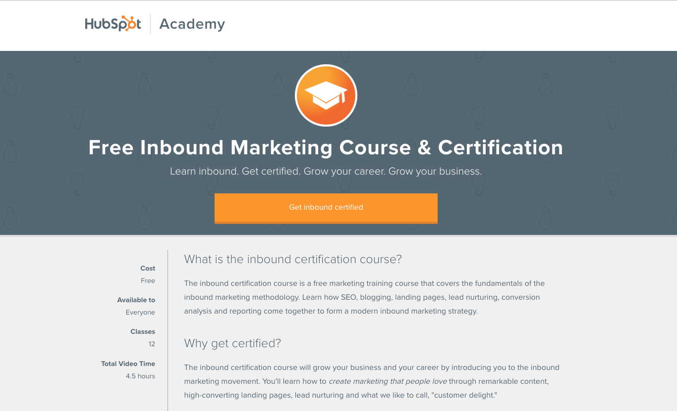
As you can see in the given image, the headline is big, bold, and easy to understand. Also, look at the giant orange button that invites users to click on the button to enroll in the course. Going further, they have disabled the primary menu for this page. As a result, there is nothing to distract users. Coming over to the copy, it is easy to read and scannable.
Week & Multiple Calls to Action
Call To Actions is one of the key parts of a successful landing page. A good CTA can help your business get numerous leads, whereas a bad one can lead to poor results. That’s why it is vital to have a good call to action in a perfect place.
In some cases, landing pages include weak CTAs that don’t work at all. The best practice to write an action-taking call to action is to observe leading brands in your industry. Another thing to keep in mind is that your CTA should target customers’ needs and sentiments.
If you are doing everything and still not getting good results, you can try A/B testing. Try different call to action and analyze the results after a certain period. A/B testing is the best practice to test your landing pages.
An example of the best CTA from Infusionsoft.

This page has a good color combination and typography. In addition, the placement of CTA is perfect, as shown in the image. You can use this image to take inspiration for your next landing page.
Continue reading ahead to find the more common landing page mistakes.
Poorly Written Headlines
According to a report by MarketSherpa, 9 out of 10 people read your headline as well as CTA. Now, to capture more leads, you will need to grab their attention. The only way to grab their attention is to write strong headlines. A headline is the primary and essential part of a landing page.
There are multiple factors you should keep in mind while writing a headline. Here are a few tips for writing a perfect headline:
- Add emotions to your headline.
- Include numbers in your headline.
- Headlines with 2-7 words show great results.
- Your headline should be simple as well as attractive.
- The headline should specify the topic.
According to a research report by CopyBlogger, 8 out of 10 users read your landing page headline. In contrast, the rest of the people read the entire copy. In addition, writing strong headlines can also help you drive traffic from social media channels.
Pro Tip: Coschedule is a web-based headline analyzer that helps content marketers create better headlines.
The tool provides instant feedback on the effectiveness of your headline by analyzing your message on six dimensions: clarity, emotional impact, uniqueness, readability, search engine optimization, and brand awareness. It also suggests appropriate substitutes for words or phrases that are not recommended to use in the headline.
Adding Many Visuals Or Not Adding At All
Adding visuals to your landing can increase your conversion rate. On the other hand, excessive use can lower your conversion rate. In addition, not adding visuals can result in less conversion. This shows how important it is to use visuals in the right way.
Also, having many images on your landing page can impact your website speed unless you have optimized them. It is essential to use images in the right amount for high conversion.
Here’s how you can use fewer images and remain effective at the same time.
According to Marketing Experiments, showcasing real people in the images can increase conversion by 35%. It can raise your CTA by 9.64%, which is incredible.
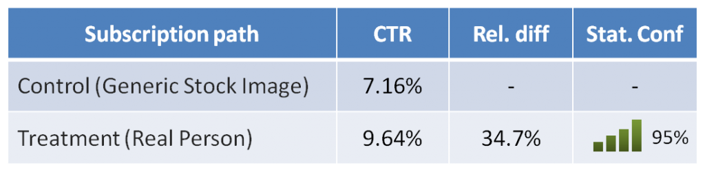
You can understand the same with the given image.

Source: Freepik.com
So, always use the right images, at the right place in perfect density, not too less and not too much.
Page Not Optimized For Mobile Devices
Trust us! This could be the cause for the low conversion rate of your landing page. Poor mobile experience can irritate your customers and force them to leave your page at a particular moment.
According to statistics by Statista, almost 211 million mobile phone searches were recorded in the United States itself in 2020. The total population of the US in 2020 was 332 million.
Almost 76% of the total population used mobile phones to do searches. Now, you can understand the importance of a mobile-friendly landing page.
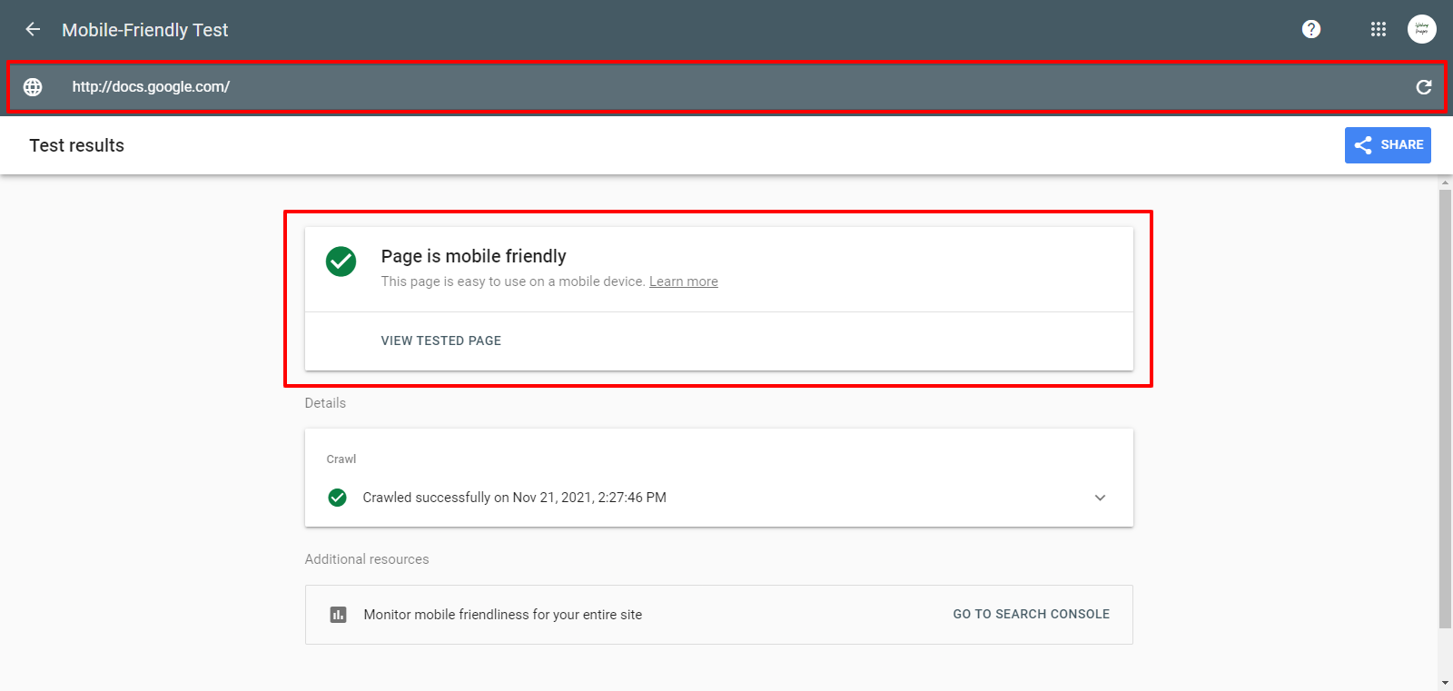
The first step is to check whether your website or landing page is mobile-friendly or not. You can check this by entering your site on the Mobile-Friendly Test tool by Google. You can access it by clicking here.
Adding Too Many Fields to Form
How many fields do you add to your lead form? 3? 5? 8? 10? The actual stats may surprise you.
Forms with three fields have greater chances of getting filled by users. According to a research report by Formstack, consumers on average find 11 fields in a lead generation form. And, those 11 fields have recorded a conversion rate of 17%. Yes, that’s a considerable percentage. With 11 fields, you can collect tons of information about your prospects.
But, the key is to make the form short and simple. Try to ask simple questions, so they don’t need to spend much time and effort filling the form.
Also, if you can’t decrease the number of fields, you can convert those questions into different types. For instance, you can create a radio button or checklist-type questions. Of course, this won’t apply to all questions, but still, you can apply on a few.
Not Showing Enough Details On the Product Page
Do you prefer buying a product without seeing its specifications? Of course, not. Neither your customer would like to.
Creating a landing page requires art and science at the same time. We use all our creativity as well as our knowledge to create an outstanding landing page.
If you don’t add enough detail to your product or service, customers won’t take action. Include each tiny bit of information about your product to let them understand your product characteristics. You should also include the benefits they will get after going for your product or service.
You can understand the same with the given image.
Neglecting Buyers Concerns
How many times do you search for a review of a product or service? I assure you multiple times.
Reviews are one of the most important factors to build trust with your customers. According to a report by Trustpilot, 89% of consumers search for a review online. This proves the importance of reviews for any business or product.
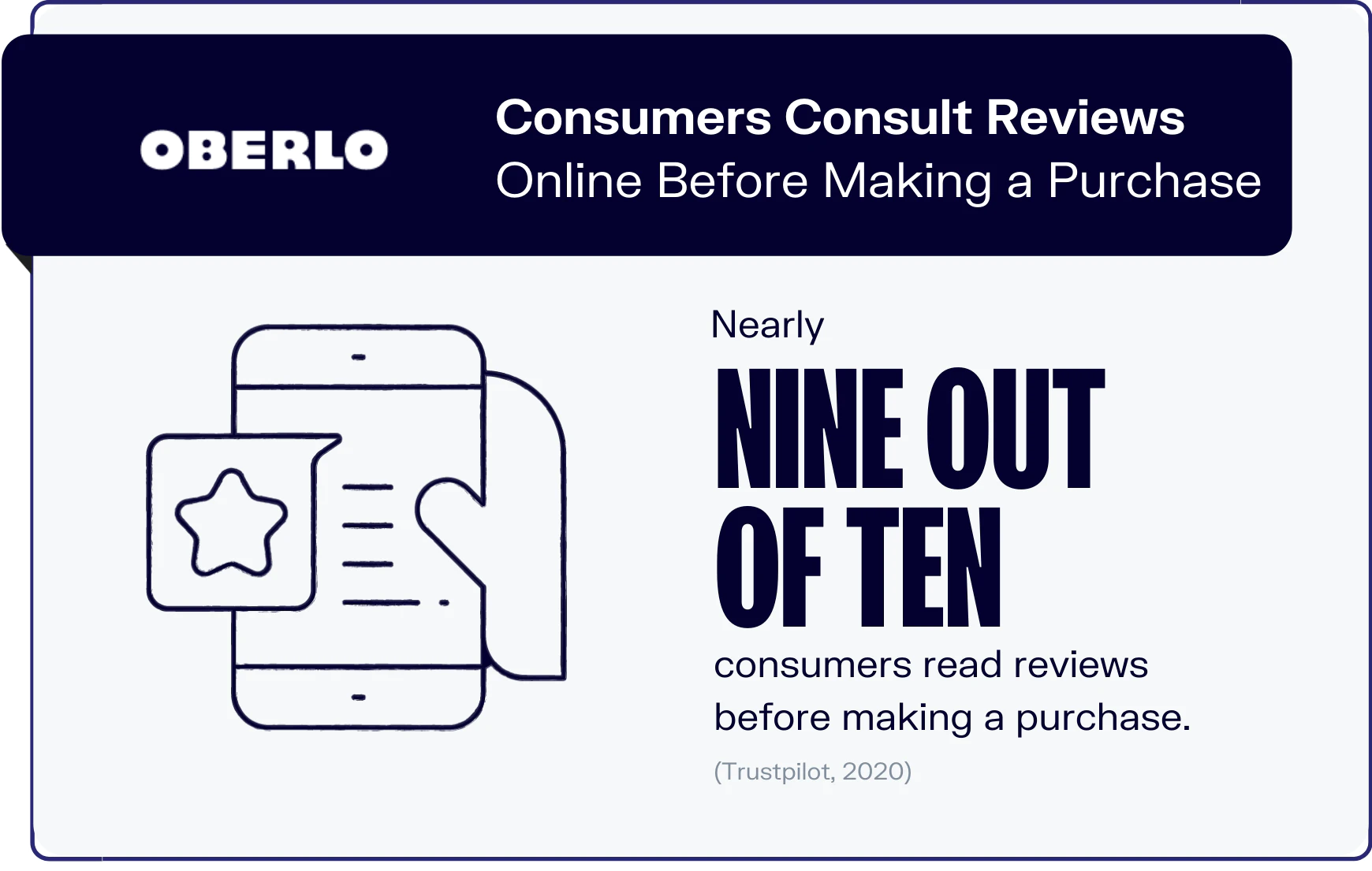
Image Source: Oberlo.com
While creating a landing page, we usually neglect a few things such as customer reviews, testimonials, etc. These things help to build trust with your customers. Ensure to include customer reviews, clients testimonials, awards, and a few other things that make trust.
On the lead generation page, you can mention things like:
- No Credit Card Required
- 0% Interest On EMIs
- 1 Year Free Customer Support
- 30 Days Money Back Guarantee
- So on
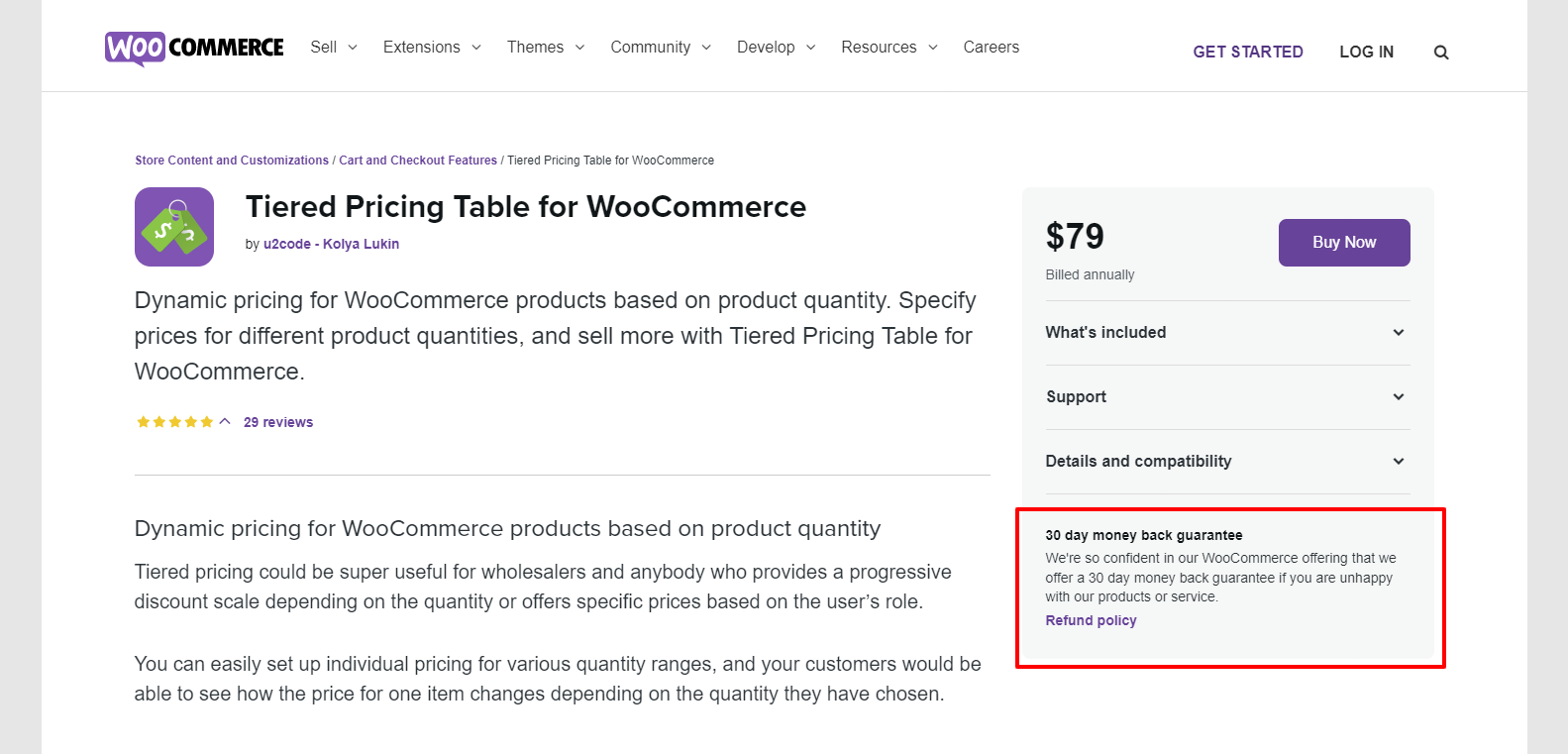
Image From WooCommerce.com
Final Words
These are the most common landing page mistakes. We look at each mistake in detail along with its solution. I hope you understood each mistake properly and figured out the issues that are affecting your conversion rate. Must apply these mistakes to record higher results.
What’s the mistake you are making? Do let us know in the comment section.
That’s all for this article. We will catch you in another article about Digital Marketing.
